


Fluorescent (neon) colours are super bright because they contain pigments that absorb ultraviolet light that then reflects back out. Neon inks are printed as spot colours – a pure colour in it’s own right rather than made out of four colour (CMYK) printing. There are lots of neon colours available in the Pantone range but for our site we are concentrating on three, Pink 860, Green 802, Orange 804. Of course, if you want a different neon ink then we can print that for you as well, just let us know which one you want and we can do the rest.
We like to give you a choice of materials for your retail products, in the same way that you like your customers to have a choice. Before you jump in to making your material decision here are a few pointers about the finished printed item.
Kraft Paper. Kraft board is a two sided board with a dark and light side and we always print on the darker side as this is more ‘krafty’. Printing any colour other than black or deep colours will always be affected in some way by the colour of the paper they ae being printed on – in this instance dark brown. Neon / fluorescent inks are very thick and viscous, so although there will be some distortion of colour coupled with absorption into the board that will affect the final colour of the neon ink, you will still get a relatively bright neon finish. Just don’t expect it to jump off the sheet and grab you! One way to emphasise the brightness of the ink when printing on kraft is to add black to the design to add contrast and make the neon appear brighter.
Recycled / Uncoated Paper. Similar to printing on kraft paper there will be a degree of ink absorption into the board that will affect the final brightness of the ink. Although it will still be recognised as a neon ink in terms of the actual colour, there will not be as much fluorescence due to the absorption.
Silk / Coated Paper. Any coated paper is going to give the very best fluorescence from neon inks, meaning that the printed design is going to be bright and bold. Coated papers have a very flat and smooth finish so the inks sit on top of the paper and there is no absorption. The ultra violet pigments can fully reflect the light back out (fluoresce) creating a very vivid and bright colour.
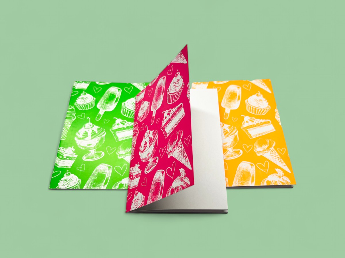

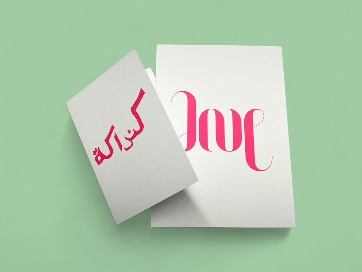

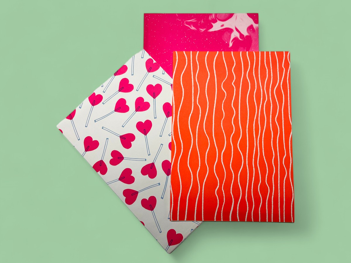

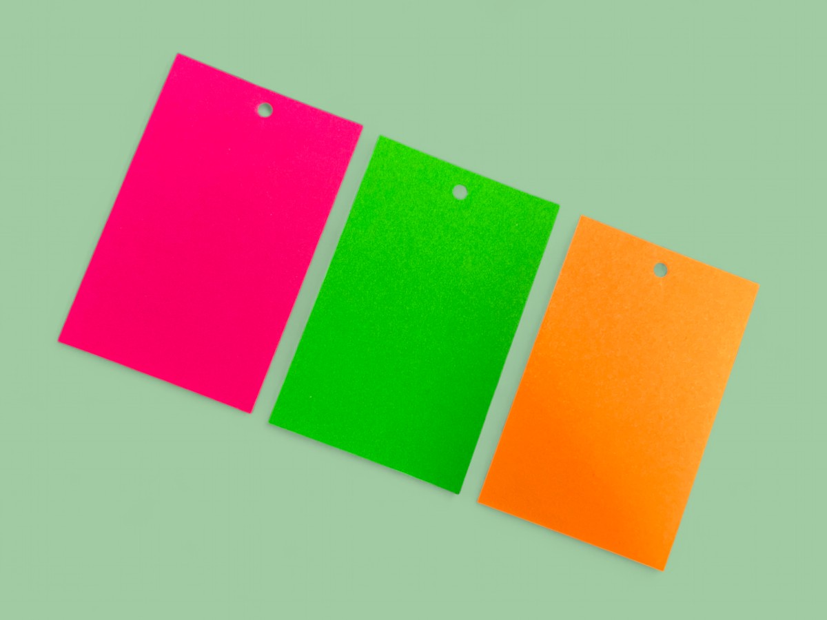

Because neon colours are so startling and bright they are very effective as a single colour design. With the current trend for simple phrase driven design single colour neon is always going to be a winner. In this instance plenty of white space is going to be the perfect background, letting the neon ink do all the hard work in communicating the design.
Adding Contrast
We provide the option of adding black to your printing allowing you to add depth and contrast to your design. A pop of black can serve to add detail, or be incorporated more fully in to the design, such as reversing black out of neon or vice versa. Have a few experiments with your design to see which combination of colours and coverage works best for you.
Keep an eye on legibility
It’s tempting to go a bit overboard with design when printing neon inks – with colour that bright and brilliant it’s easy to let the use of colour become visually overwhelming. If your design is to carry a message or logo make sure that it does not get lost in the excitement of fluorescent ink.
Clash of Colour
We are all for pushing boundaries! Incorporating neon inks in to your design can have fabulous results. Try swapping magenta for neon pink when designing in CMYK, or add neon orange as a fifth colour for results that really jump out. Or if you want to go totally overboard mix two, or dare I say it, even three neon inks for an eye-popping result. If you want to go down the slightly bonkers experimental route get in touch for advice and pricing.