Basket


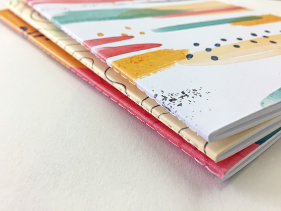
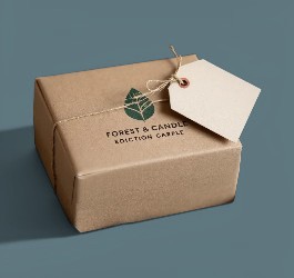
 There is no getting away from it – printing on kraft board and paper has been inspirational and injected a new lease of life in to more than just the eco and craft movement. Its traditional appearance has been embraced by the hippest and most contemporary of designers who have used the retro brown material as a counter to their modern designs. And it works brilliantly well. From packaging to invitations and flyer printing, kraft board has found a new place in the world of print.
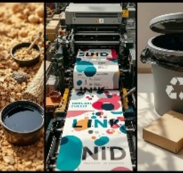
Kraft board was originally designed as a packaging material with high tear resistance and durability. Made by the kraft pulping process, from which it gets its name, kraft board is very strong and thicker than other board which makes it an interesting material for designers to work with. That, combined with the fact that it is 100% recycled, made entirely from post-consumer waste, excels it in to the realms of most desirable for all things printed.
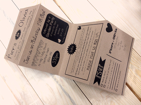
Since we have been printing on kraft paper and board we have seen its colour vary from reddish brown to a grey brown and everything in between. It is now stabilised as a true two-sided board with grey/brown on one side and a ‘conventional’ kraft brown on the other. Given that the colour of the board to be printed is largely brown, it can be a very versatile vehicle for the right design.
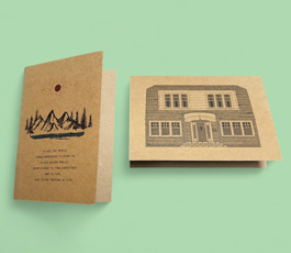
Make a visual statement with flyer printing on kraft board
Kraft board undoubtedly makes a bold statement, combining a very desirable natural and vintage appearance. From its traditional uses for packaging materials it has now stepped firmly in to the limelight as a statement material for business, promotional and marketing print. Typically we are seeing it used mostly for bespoke packaging, wedding invitations, flyer printing and business cards – all of which benefit from the strong visual appeal of kraft.

Strong, dark colours tone beautifully with the brown board and work with the material rather than against it. Having said that a foray in to neon also works well, delivering a zinging juxtaposition to the kraft colour. For stand out design steer clear of softer or pastel colours which tend to get lost on kraft.

With a range of kraft board products available on our website all you need to come up with is the design – and if that isn’t coming to you easily why not get in touch and we will be happy to guide you in the right direction.