Basket


 Who would have thought that the colours on that printed flyer you’re handed in the street, or which drops through your letterbox would create a subconscious reaction, impacting your buying decisions?
We all know that colour has a significant subconscious effect: we know that blue, for example, is cool, while red is hot — and also signals danger and passion!
Because of colour’s emotional connections it’s really important to consider the colours that you select for your printed flyer; it will give a strong message about your business and the services that you are offering.
Psychologists have made lengthy studies on our reactions to colour and it’s no accident that many instantly-recognisable high street names are associated with a particular colour. When choosing your corporate colour it’s crucial to consider whether your business is national or international. Colours have different meanings all over the world: for example in India brown represents mourning and in China white represents death. Who would have thought that pink is used for baby boys in Belgium?
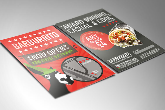
Why has a well-known budget airline selected a rather startling orange? That’s because orange represents friendliness, vitality, fun — and also affordability. Research has shown however that it’s one of the most disliked colours in the Western world, although that hasn’t stopped fast food chains recognising that it’s a colour which stimulates the appetite.
If your business is just starting up, your printed flyers may be the first thing that you utilise to spread the word, rather than considering a whole corporate colour. In this case you still need to think about the subconscious message that you’re sending.
Do you want to suggest honesty and trustworthiness? Then blue is your colour (it’s especially popular with financial businesses).
Green is associated with nature, health and healing and is an excellent choice for health products or companies who are involved with the environment; brown is synonymous with earthiness and is especially appealing to men.
Does yellow appeal for your printed flyers? Unsurprisingly yellow is the colour chosen to represent cheerfulness and positivity. It appeals to children and is linked to their imaginative powers.
White stands for simplicity and order, cleanliness and purity, which is why it’s often used as a background for skincare product packaging and advertising.
Purple is especially popular with creative people. It signals wealth, prosperity and is also a soothing colour; it can add elegance to your printed flyers.
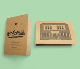
Bold colours on your printed flyers will give instant impact. They’re ideal for restaurants and take-away food businesses. More muted colours can be equally effective, though and can be used for dentists and spas, for example. It’s important to have enough white space so that the eye is guided as it reads the content.
So you can see that you’re sending a message with your choice of colour, possibly even before your words have been read! Choosing the right colour will enhance the impact your printed flyers make on your target audience.
With a simple online ordering facility and 48-hour express turnaround, Just-Printing offers a hassle-free online portal for those seeking inexpensive printed flyers.
We also offer our customers folded leaflets, postcards, business cards and an array of customised branded products. If you require any advice, or just want to find out more about the range of services we provide, please give one of our friendly team a call on 01903 742003 or click here or drop by your printer in Sussex, A Local Printer.