Sometimes the simplest colours work really well together. We especially love when a designer has harmonised the colours tonally. These printed business cards demonstrate perfectly how a simple colour palette can be very effective.
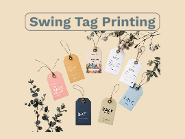
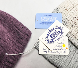
Swing tag printing is a growing market as people realise that you can use a swing tag just as well as a larger piece of print. Compact but full of design opportunities our swing tag printing comes in all shapes and sizes - have a look at this one for a simple but effective design.
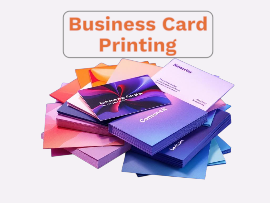
From an all black business card to one that is a riot of understated colours . Business card printing that stands out from the crowd is the aim of the game.
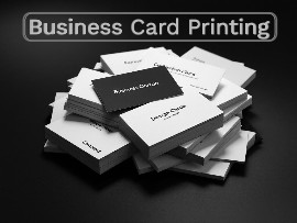
The use of black in design is a given - but a design that is only black is pretty daring! Have a peek at these printed business cards and see if you agree.
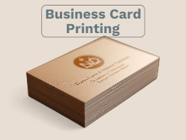
Designing a business cards seems simple - right? But getting the design exactly right can be tricky. Business Cards Printing is is a key product to us - take a look at this one for a clever use of colour.
Get It Right the First Time: How Our Help Section Makes Perfect Prints Easy
Creating the perfect print can be incredibly rewarding—but it can also feel overwhelming. File formats, bleed, colour modes, resolution… it’s a lot to take in, especially if print isn’t your day to day world.
That’s exactly why we’ve built our Tips and Guides Section: to assist you step by step, eliminate guesswork, and make sure your designs print exactly as you expect—every time.
Here’s how our Help Section helps you get it right from the start.
Despite the prevalence of digital marketing channels print can be a powerful tool for generating leads for your wedding business. With the wedding season fast approaching now is the time to ensure that all of your marketing is in place and up to date ready to wow all the couples tying the knot!
Some top tips to consider for your marketing print are:-
Compile a current portfolio of your recent work to include photos, videos and testimonials.Showcasing your previous experience and style will demonstrate your capabilities and give couples confidence in your services.
Develop customisable packages that cater to different budgets and preferences. Consider offering special promotions or discounts at wedding fairs to incentivise couples to book your services.
Be transparent about your pricing structure and what is included in your services. Avoid hidden fees or surprises, and clearly communicate the value that couples will receive by choosing your services.
For those of us old enough to remember, a hand operated Singer sewing machine was generally employed to fashion school uniforms, soft furnishings and various other items of clothing that would probably make your hair curl.
These days however the Singer sewing machine is enjoying a new and alternative lease of life in print finishing. Yes, the Singer Sewn Notebook has finally arrived.
As online printers, at A Local Printer we create many kinds of marketing material for your business. Brochures, posters and flyers with eye-catching designs will certainly appeal to your customers, but take care not to overlook the importance of a good writing style and the correct use of grammar and punctuation in all your promotional materials.


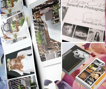
 Despite the prevalence of digital marketing channels print can be a powerful tool for generating leads for your wedding business. With the wedding season fast approaching now is the time to ensure that all of your marketing is in place and up to date ready to wow all the couples tying the knot!
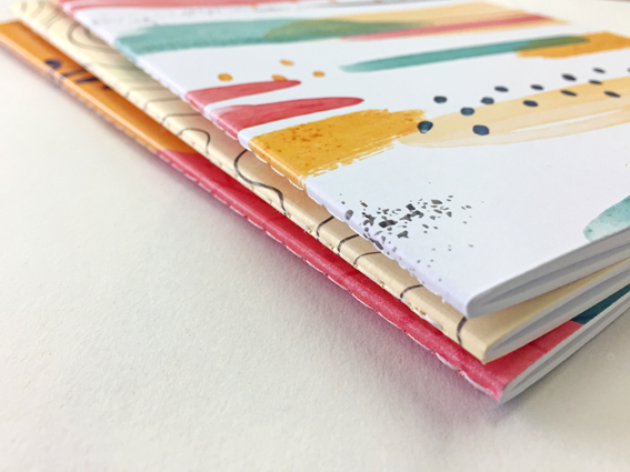
 For those of us old enough to remember, a hand operated Singer sewing machine was generally employed to fashion school uniforms, soft furnishings and various other items of clothing that would probably make your hair curl.
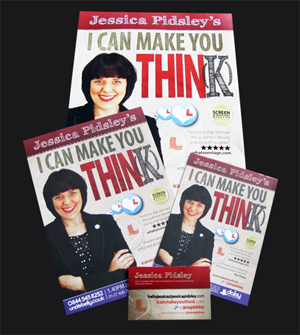
 As online printers, at A Local Printer we create many kinds of marketing material for your business. Brochures, posters and flyers with eye-catching designs will certainly appeal to your customers, but take care not to overlook the importance of a good writing style and the correct use of grammar and punctuation in all your promotional materials.


 Basket