Basket


 It is now official that grey is more popular than black – in terms of car colour at least. But in terms of all aspects of design grey has been steadily marching up the charts for several years. A trendy pub or restaurant will greet you with calming grey walls and dark grey trim; soft furnishings match and compliment grey tones; cars, clothes, nails and even hair are now vamping up grey.
Grey has played a strong supporting role for years, particularly with blues and oranges. Its very neutrality makes it a background of choice for layering colour without being overpowering. But what is grey and how can it be used to best effect?
For many years grey was a ‘non-colour’ used primarily for utilitarian objects like battleships and office desks, until it was recognised as the perfect pairing partner for making colours pop. But greys now come in a range of hues that read either warm or cold. A click through to Pantone will show you 50+ grey swatches (almost 50 shades of grey!) – all quite different and ranging from warm light greys to dark masculine greys, taking in green greys and mauve greys along the way.
Harmonise your colour pallet for the best eco print and design
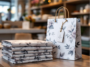
In terms of design, using only greys (or greyscale) colour pallets can lend a minimalist, sophisticated look to a design. Using a range of greys, you can add warmth or coolness to a design by adding hints of blue or red. An all grey design is not for everyone but it sure stands out from the crowd!

Grey is a neutral colour that offers balance, and because it can be warm or cool it pairs with almost every other colour. Incorporating grey in to your design will be on trend, act as a the perfect foil for your key colour and add balance and depth. We have seen a steady increase in the use of grey, particularly in leaflets, postcards and brochures. Have a look at our new Black Only printed leaflets for am on-trend product that comes with cost savings!