Basket


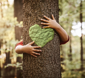
In 1921 the phrase “a picture paints a thousand words” was coined by Frederick Barnard describing the effectiveness of using graphics in advertising. And he wasn’t wrong. Designing for the web has the benefit of plenty of white space for including all of your graphics and allows for varied ways to promote your message or products. Designing for print however does not have that luxury. Often there is limited opportunity for graphics and it falls to the words, the typography, to make an impact on your audience.
In print design typography is a crucial element. Typography essentially involves the application of organising, arranging and adapting type. In print, typography doesn’t have to be dull and lifeless. It has the opportunity to be stunning, imaginative, inspired and colourful. There are plenty of ways to enliven your printed piece through typography; innovative and original layouts, colour variations, inspired use of fonts plus more besides.
Typography (typeface) has its own character and personality and choosing the correct typography for your printed piece will have an impact on the reader – so getting it right is key!
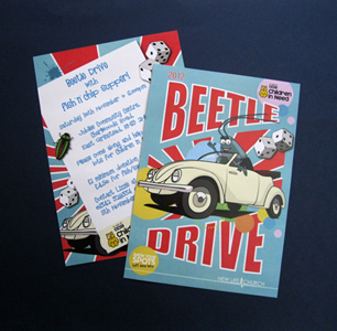
 The key to getting the typography right is determined by your message; personal and fun, formal/informal and fun, human; retro; serious. This Beetle Drive leaflet print conjours up a Fifties/Sixties retro style that sits perfectly with the image - it looks like it is going to be fun!
Because fonts, and therefore typography, triggers different memories and feelings (yes, emotions!) it is important that you choose a font that sits happily with your message. Don’t choose a goofy lightweight font for a serious message because it won’t be taken seriously. Similarly, for marketing that is designed to appeal to our fun side the Baskerville font (recently recognised as the most ‘serious’ of all fonts) will not do your message any favours.
So you’ve carefully selected the font that fits. Now what? As all users of UK train services will be aware there is always a warning to ‘mind the gap’. So just a quick note, adequate spacing between characters is important for the readability of your printed text. If they are all crammed together the reader must spend time deciphering what they are reading and this is just time consuming and boring so like all normal people they just give up. This 2 for 1 Cocktails printed flyer has a simple message that is easily read and digested, and whilst the font is more 1920's than 1960's it sits easily with the image. And who doesn't want two for one anything!
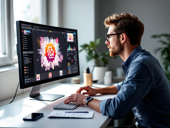
 Now on to step 2. You have a font that speaks a thousand words and gets your customers emotional juices flowing. You have your images sorted out and you know what you want to say. All you need to do is pull it all together into one seamless, memorable, authentic, convincing printed flyer or leaflet. Well this bit is not always as easy as it sounds - and I’m not going to tell you how to do it because each printed piece will be unique to its owner. What I am going to suggest is that you acknowledge the 2 second rule i.e. you have just 2 seconds to get and keep your customers interest. So spend a little time looking at printed leaflets and flyers that you find attractive. What is it you like about them? The size, material, layout, typography, pictures and possibly even the words! I certainly do not advocate ‘liberating’ someone else’s designs, but learn from what you like and put it to good use.
When you have finalised your design and are ready to press the ‘go’ button at A Local Printer you will find a simple one-stop-shop for all your printed flyers and flat or folded leaflets print.