Basket


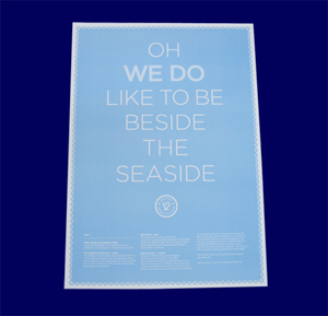
Why typography can make or break a print poster

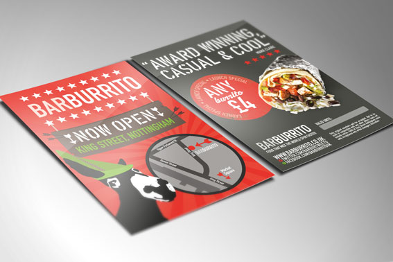
When creating a print poster, or a leaflet, brochure or flyer for your business, it’s important to get every aspect of the design right in order to draw people’s interest. But while features such as images and colour are key for print posters and other marketing materials, it’s also important not to overlook the typography used in the design. Typography combines elements of the overall branding of any piece of promotional material, be it a poster, flyer, blog post or a letter, as it evokes a certain feeling for the reader and it can engage and retain interest.
What exactly is typography and why is it important for a print poster?
As Hermann Zapf, the famous typeface designer, said: “Typography is two-dimensional architecture, based on experience and imagination, and guided by rules and readability. And this is the purpose of typography: The arrangement of design elements within a given structure should allow the reader to easily focus on the message, without slowing down the speed of his reading."
Typography is all about choosing the right font that fits best with the branding of your print poster, but also about how it is laid out on the poster, in terms of spacing. The font must be easily readable, and visually appealing, but with so many fonts to choose from, it is easy to find one that is perfect.
How can I choose the right font for my print poster?
If you’re creating your print poster, brochure, flyer or leaflet using a desktop publishing programme, you’ll most likely have a library of fonts available. The trick to finding one that works is to layout the text of your poster within the final design (including images and colours), and then change the font to different styles so you can see which works best.
Some popular fonts that are easy to read on a print poster include:
• Calibri
• Georgia
• Gill Sans MT
• Palatino
• Verdana
It’s best to avoid delicate or messy typefaces such as script style fonts or gothic style fonts (unless you are promoting, for example, a Halloween event) on a print poster.
Try to stick to one or two fonts in the print poster (you could select a different font for headings than for the main body of the text), as too many variations will make the design look messy.
Once you’ve chosen your font for the printed poster:
To ensure the design of your print poster, leaflet or flyer is perfect; there are a few more things to consider once you’ve chosen the correct font to use. These include:
Formatting a printed poster:
The formatting of the font will need to be consistent throughout, or the printed poster won’t look as sharp and professional. Ensure that the line spacing remains the same throughout, and if you’re using bullet points make sure that you use the same style.
Make sure too that the text is properly aligned so that it is easy to read. Aligning the text to the left or right tends to look better than aligning text to the centre, which is harder to follow for the reader.
As famous designer Helmut Schmid said:
“Typography needs to be audible. Typography needs to be felt. Typography needs to be experienced."